

Get Your Stats Right: October 2024
What are the numbers behind our recent turnaround? Plus a dive into some player-specific data

It’s an absolute pleasure to have the brilliant Ben Griffis writing these new monthly columns for UTAS, delving into the numbers that make up the U’s performances using his own statistical data and modelling. Give Ben a follow to discover more of his brilliant work, and subscribe below to get every instalment directly to your inbox.
Well, quite a lot has happened since our last GYSR edition… The board put out a statement backing Garry Monk on October 7th and actually used the phrase “underlying statistics”. The future is now.
Then, the next game (which happened to be 12 days later so we could all stew on the underlying statistics in question) brought the first win of the season, 2-0 against Wigan at the Abbey.
Then a second win.
Then a third win?!
And all of these were clean sheets?!?!?

The board understands underlying statistics. While it was not a guarantee that the U’s would win the next 3 games after sending out that statement, these points maybe weren’t as surprising as the form in the first 9 games would have some believe. I’ll be the first to admit I had some worries since after 9 games we were underperforming most important metrics (it’s in writing too so I’m forced to own it), but even looking at those 9 games, many losses were so narrow that it simply was just a matter of time before we got that first win. Now it’s 3 in a row heading into a short break in league games while we play in the FA Cup.
And so, without further ado, let’s stoke the “underlying statistics” flame a bit more into an underlying bonfire.
WHAT’S CHANGED?
Outside of the obvious, and quite helpful, fact that United’s shots going in while the opponents’ shots didn’t go in, there have been some changes. Let’s look at some graphs to show the recent improvements…

This image shows how, in general, the team has had lower possession than usual recently. Actually, in the 6 games since the last GYSR edition came out, 5 of them (the most recent 5) have seen us have less possession than our season average so far.
Less possession, but not necessarily less attacking opportunities. It appears that Monk has changed to be a little more direct, or rather, just trying to get as high up the pitch as quickly as we can. This is a welcome tweak as the foundation for possession was there in the first several games, but we found it difficult to break the opponents’ lines.

We can see that the club’s field tilt has steadily increased in October, despite possession decreasing! I’ve beaten this “field tilt” horse so much in the first two editions so without going into any more detail than I have already, seeing the U’s change to a slightly lower possession & slightly high field tilt style is wonderful. This is how I think the club can win games consistently. More balance.

This all comes together when looking at open play expected goal difference (xGD). After a season-low -1.15 in the Wycombe game, the club has steadily improved, coming to a head in these three wins, naturally. So, the change in possession & field tilt has been successful in the quality of play and of course in the results.

I have two more “underlying statistics” graphs to share, so bear with me! In the graph above we can see United’s points minus expected points. Expected points is a model that I use to get a general sense of a team’s performance in a game. It’s bounded, naturally, 0 to 3, and is based on the xG for each team. I’ve written a much more detailed article on my website if you’re curious about the math behind it.
We can see that United had been underperforming their expected points for effectively the entire season up to these last 3 games. In particular the Rotherham and Exter losses, we lost each game 1-0 but should have at bare minimum drew both, right?
It’s natural to have some stretch of under-performance, and then over-performance, ebbing and flowing above/below 0. But we are finally in the “over-performance” region for a moment. The keys are to:
1) Continue to improve our expected performances (they’ve been improving for several games now; we see that on the pitch and in the numbers).
2) Understand that to continue our march to safety, we’ll have to keep over-performing in a few games to make up for the very underwhelming start to the season.


Finally, to tie it all together… My “game control share” model (bounded from 0: absolutely no control, to 100: total and utter domination) looks at everything from shots, field tilt, defensive actions, and even keeping the opponents deeper in their own half, to come up with a percentage of the game a team likely “controlled”.
This is different from expected points, but in general it’s a similar idea, just trying to quantify more tactical elements instead of only focusing on shots. This can help add context to expected points and offers a single-number glimpse into several components of a game.
Just look at that massive jump from September into October. From about 30% game control over the first 7 games to around 70% over the next 5! We have to give a lot of credit to Garry Monk, his staff, and the players for all working out some major kinks in the tactical system. We’re able to break lines now. We’re able to be more comfortable without the ball. We’re able to get up the pitch with vigour.
The club needs to continue to improve the “underlying” numbers and the “overlying” numbers (goals scored & conceded), but for a while now I’ve been saying the underlying stats looked good. The board said it as well. Finally, Monk & the gang have seen their work and patience pay off.
So, with that team analysis, let’s get into some player data.
PLAYER DATA
We’ve passed the (very general) 10-game mark in the season, which means it’s my favourite time of the year. There’s finally a decent sample size of games & minutes played for a lot of players that allows us to look more closely at the players’ underlying data and see how they stack up to the rest of the league.
In true GYSR fashion, I’ll spend a bit of time this edition to introduce the key ways/methods we can use to generally analyse a player’s numbers. I will share some players, but in the interest of not turning this into a 6-hour-long read, I can’t dive into everyone.
The most-used method of seeing a player’s underlying numbers and comparing them to the league is by using what’s called a “radar” or “spider” plot. Many will also call this a “pizza” plot.
These are effectively bar charts arranged in a circle. Each bar highlights one metric/statistic/aspect of the game – almost always adjusted per 90 minutes or the number is a percentage/ratio. The bars are almost always “percentile ranks”, which are numbers between 0 and 100 (or 0 and 1). 0 indicates the lowest number a player in the sample recorded, and 100 is the highest number a player recorded. The sample is almost always position-based, which means if your focal player is a winger, the sample is all other wingers in their league that have played a specific number of minutes.
You may have heard of percentiles before. Parents (at least in America) are almost always told what percentile their young child is in for height and weight. For example, I was in like, the 5th or so percentile for weight as a child. That meant that I weighed more than just 5% of other boys my age. Or to flip that, 95% of boys my age weighed more than me. I was around the 70th or so percentile for height, meaning that I was taller than 70% of boys my age (yes, I am dressing up as Slenderman for Halloween, it’s called a regular Thursday for me).
The “median”, which is a type of average, is the 50th percentile. This is the middle number of a set of values. If you had 7 numbers, the median would be the one where 3 numbers are higher & 3 numbers are lower. Since 50% of the sample has to be greater than that number!
So, for football, if a central midfielder were to make 1.47 progressive runs per 90 minutes, ranking in the 84th percentile, we could say that this player is probably a pretty effective carrier of the ball. Only 16% of central midfielders in that league have more progressive carries per 90 than this focal player.
That player is James Brophy.
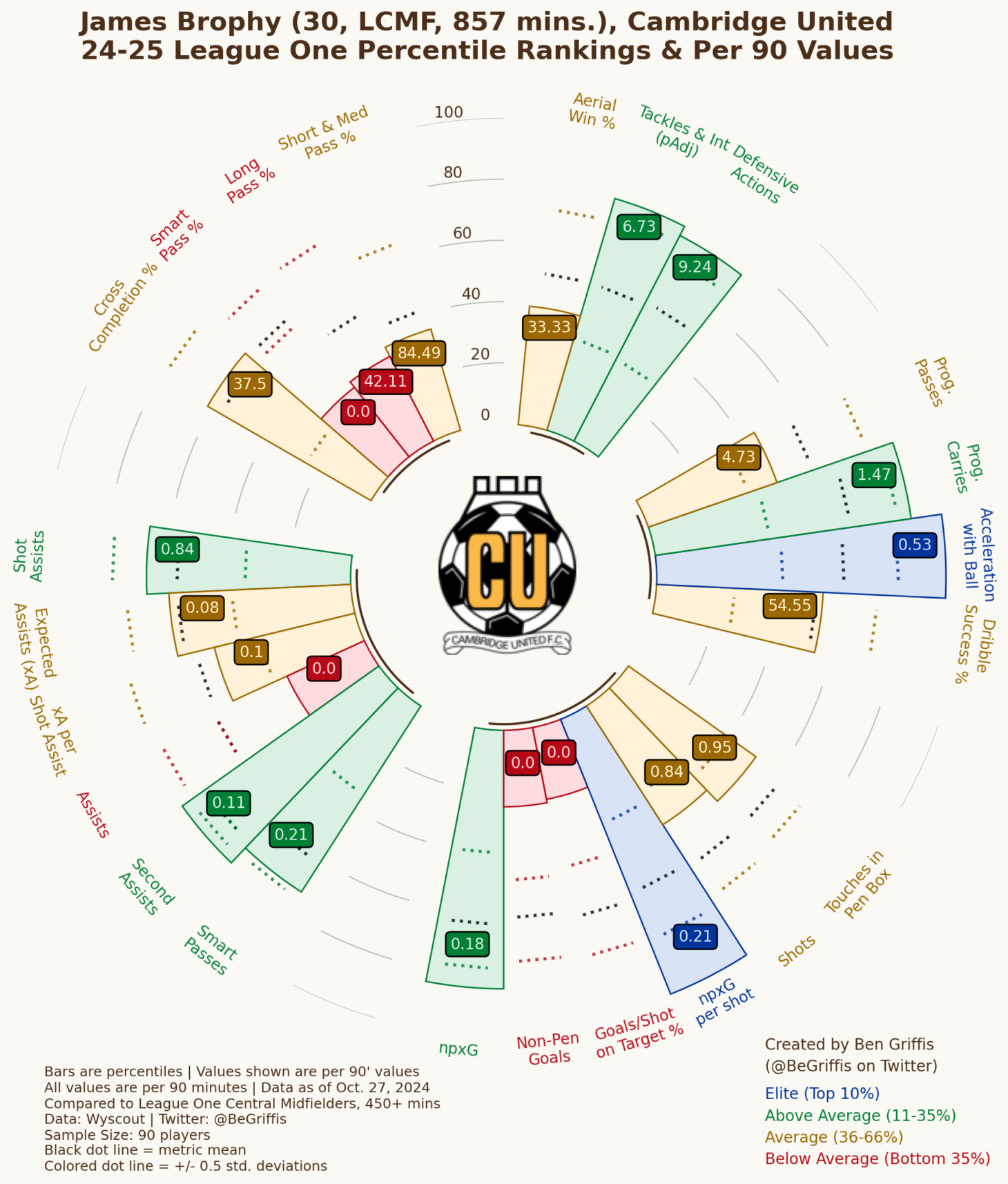
This is what a player radar looks like. And if you want to create these for any player this season, I have an app for that! Follow this link, there’s instructions and a tutorial video if needed. And here is Wyscout’s glossary of their metrics, complete with definitions and images to illustrate each metric.
But, we can see the bars all representing different metrics, such as aerial win %, progressive passes, shots, etc. The numbers shown on each bar are the per 90 minutes numbers (or percentage for metrics like aerial win %), and the “height” or “length” of each bar represents that metric’s percentile.
I group my metrics into general “buckets” of related metrics, so we have passing completion as the 4 metrics grouped together in the top left, then counter-clockwise we have creative metrics, then shooting, then progression, and finally in the top right are defensive metrics. Generally, it’s best practice to have different radar templates for different positions. I have an attacking template and a defensive template on my app to make it easier to approach.
I personally color-code each metric based on its percentile to make it much easier to get a general profile of the player, and so that we don’t get bogged down on things that have zero meaning, like if someone is 79th percentile being “better” than someone that’s 74th percentile – those are just too similar to argue on.
1) Elite (blue) = the top 10%
2) Above Average (green) = The top 11-35%, so 89th-65th percentiles
3) Average (beige/yellow) = the middle third, i.e. 36th-64th percentiles
4) Below Average (red) = the bottom third, or 0-35th percentile
Percentile player radars are best used for getting an idea of a player’s profile, rather than necessarily their quality. I need to stress that, because all data is impacted by many factors, including tactical instructions. Just because a player has a low progressive pass percentile, doesn’t mean they can’t play progressive passes. It might mean they personally prefer to carry the ball up the pitch and then play a short pass to an attacker, or perhaps their manager has instructed them to not play progressive passes as they might be longer, more risky passes and the manager prefers a short, less-risky pass.
Why Brophy?
The reason I’m using James Brophy’s radar/data as my illustration is because UTAS had a great question from Sam Gisby: “Brophy can get a bit of stick for his lack of goals, but are there any more hidden stats where he stands out as one of our top performers?”
And the answer is, YES! Brophy hasn’t scored yet. He also has had no assists (according to Wyscout… Opta has him at 1 assist. This is a good example of how different data providers may have slightly different numbers even for assists, especially in the case of a possible deflection on an assist). So, if you look at the “traditional” stats he’s just kinda… there. But the beauty of football data is that we can tell computers to collect specific information, or we can take the events of the game after the fact and calculate different things that help explain the sport. These are the “underlying numbers”.
I will say that my data is from Wyscout, and Wyscout has flagged Brophy as a central midfielder, despite him also playing as a WB as well (and in some games Wyscout has him as the LCM when in reality he was the LWB). He’s versatile but it’s pretty bad statistics to compare all wingbacks/fullbacks and central midfielders since they are very different positions/roles, so we have to draw a line. He’s played most of his minutes as a LCM per Wyscout, so he’s compared to all midfielders. Knowing how to use/interpret data requires us to know how that data is collected/compared in the first place.
From his radar, we can see Brophy is – in general – average to above average in creative, progression, and defensive metrics (compared to other central midfielders with at least 450 minutes this season, i.e. 5 full 90s). So, to Sam’s question, I’d say if he’s getting stick for not scoring or really assisting, those giving him stick should take a step back and see how he’s facilitating a lot of United’s play. He’s progressing the ball up the pitch consistently, he’s creating opportunities, he’s solid defensively… yes, he hasn’t got on the scoresheet yet but neither did Claude Makélélé and he was an intensely vital cog to Real Madrid, Chelsea, and France sides for over a decade.
Not that I’m comparing Brophy to Makélélé, of course, but saying how not all players who play in midfield should show up on the scoresheet. A lot of midfielders are very impactful by facilitating buildup, progression, and creating attacking movements rather than finishing them off themselves.

Another player’s radar I want to share here is Paul Digby. Digby is one of the tidiest midfielders in the league on the ball. He has a short pass completion rate & a long pass completion rate well above average. He’s also completed 3 of his 4 dribbles, which isn’t a huge sample but at least helps back up his tidiness.
Of course, he’s not the most creative or progressive midfielder out there, which shows up in his radar. This is why it’s good to use these as a profile of a player rather than just looking for a lot of blue/green/”long bars” to judge the quality of a player.
Again, please feel free to play around with my app if you want some more players’ radars. This is already a long article (as all “here’s what this data concept means” articles will be sadly), so no need for me to share everyone’s.
MAILBAG QUESTION: LOCATION OF GOALS
We had a great question from Gibbo under the recent Stats Special podcast. It relates to Brophy as well, so maybe this is the Brophy Edition of GYSR.
Basically, Gibbo hypothesizes that Brophy might not be scoring yet because he might not occupy the areas of the pitch where goals normally come from. And not just United’s goals, but just goals in general, in the Premier League and League One specifically. Gibbo’s thinking is that goals may be scored more from half-spaces than elsewhere. And just in general, perhaps Brophy isn’t in the area(s) of the pitch where goals are scored even if that isn’t half-spaces.
I’ve gathered the data for this season so far for the Premier League, Championship, League One, and League Two. Here are the locations of all goals scored in each league so far, with an average distance arc (dashed circle in the box) and average meters from the centre of the pitch that goals on the left & right are scored on (red/blue lines).
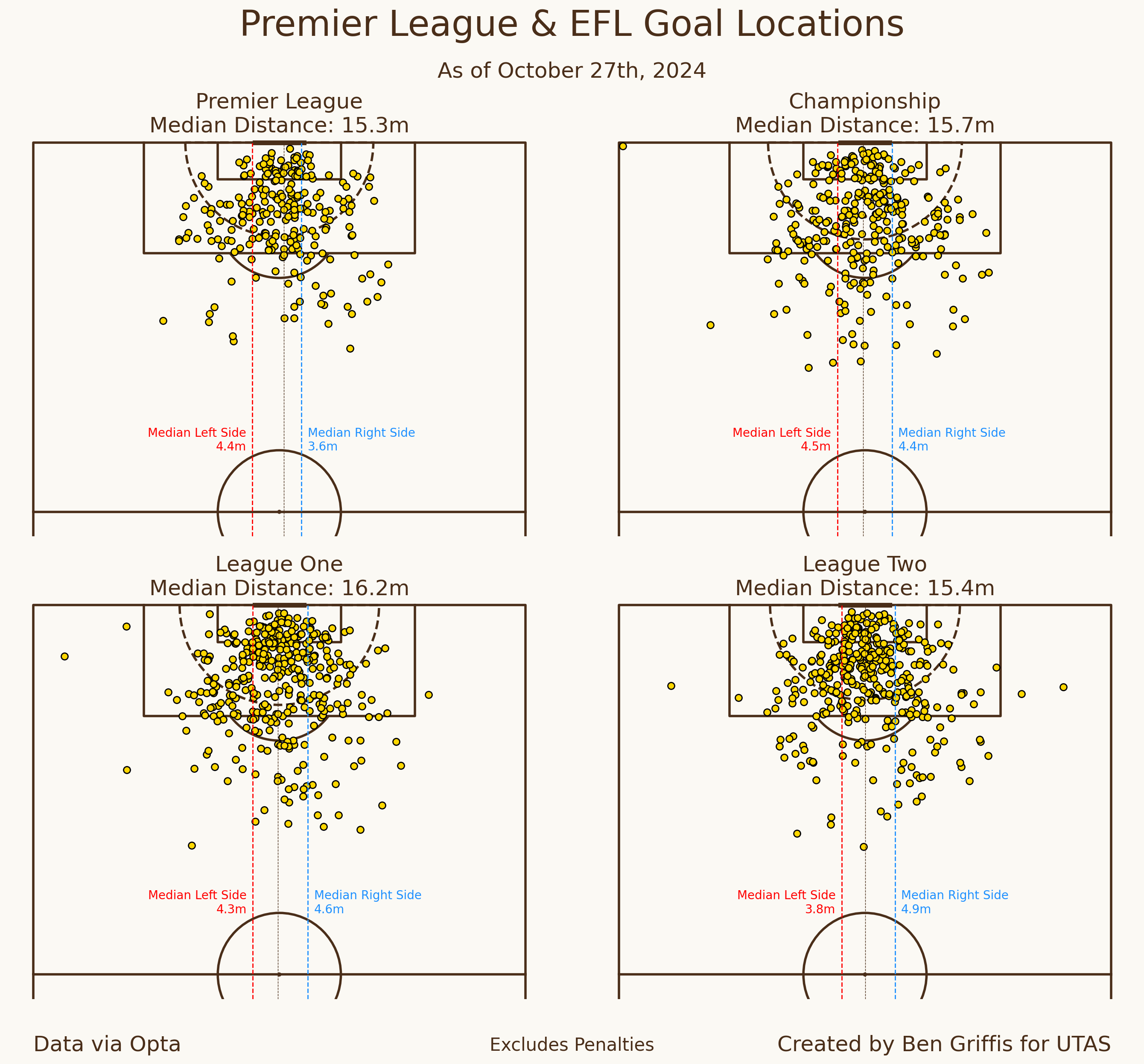
We can see that, overall, goals mainly come from central locations. This makes perfect sense since the angle to the goal is much lower than the angle from a shot off to the side. Shots from the side of the box effectively have a lot less space to aim at to score, so the goalkeeper may have an easier time blocking off a larger part of the goal.
But each league is slightly different in terms of the average distance from the net goals are scored from and the relative right/left skew of them.
The Premier League and League Two share about the same average distance, around 15.3-15.4 meters out. The Championship is about 15.7m, and League One has the longest average distance, 16.2m.
League One and the Championship are both pretty evenly spread in terms of right vs left, with League One’s goals from the left side being about 4.3m from the centre of the pitch, and goals from the right about 4.6m away. The Championship is 4.5m and 4.4m respectively. Both leagues have seen a couple more goals from the left than the right, but not by much.
Overall, as you might expect goals in League One this season are scored from relatively central positions inside the box. And further, we can see that goals from outside the box are often scored from the right or right-central locations.
Below is an image showing Brophy’s actions this season. Completed passes & shots are on the left, and defensive actions are on the right.
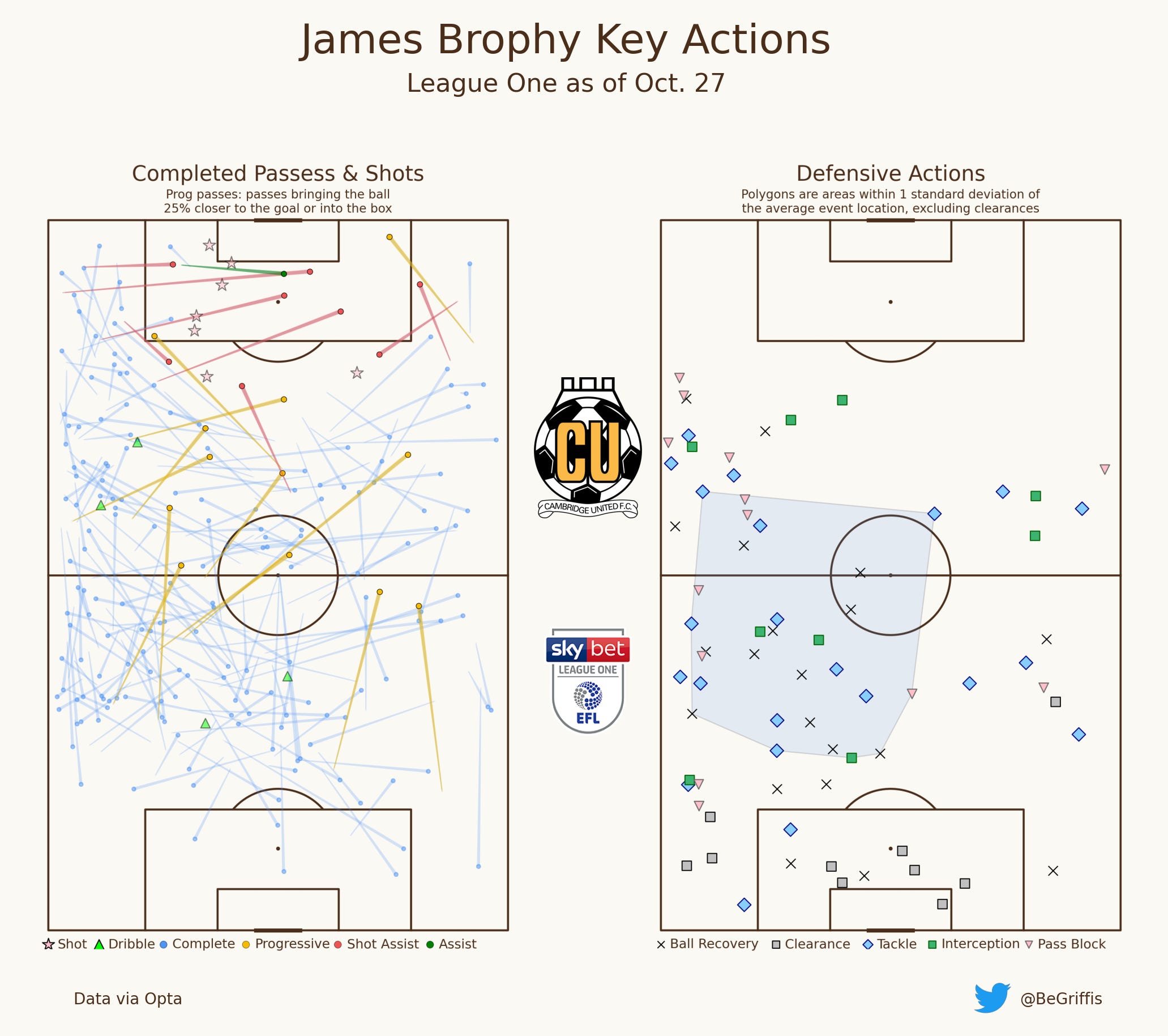
Brophy has not taken a single shot from a central area. In fact, he’s hardly even played a pass from central areas in the final third, which means that it will be very difficult for him to be in an area where he could realistically have a high-chance shot. Of course, that’s watering everything down but sitting more on the left than central in the final third will usually make it harder to score a goal than if he were more central.
However, this image also shows how well Brophy has facilitated progression and creation this season. We can see a lot of vertical balls up or into the middle of the pitch, as well as a lot of passes from half-spaces onto the wings near the opposition box. And we see a lot of shot assists off crosses. This also shows his ability to recover the ball high up the pitch on the left and the right side.
Overall, multiple people have asked about Brophy’s underlying data. I hope this edition of Get Your Stats Right can help everyone, well, start getting their stats right! In general, they tell us that Brophy has been pretty solid and helped the team in a lot of ways, even if he’s yet to score.
As the season marches on, I’ll be able to keep sharing these player radars and player action dashboards, as well as addressing any questions you may have as best I can…
Feel free to leave comments below on articles/pods or reach out to hello@undertheabbeystand.com to ask anything, and I’ll try my best to address as much as I can.
 | A guest post by
|
This is just always so so so good.
One metric that would be interesting to look at is some of the more physical aspects of the game. I get the sense Diggers could run and run and run and run. Is there a way to look at the distanced covered on the pitch?
Are certain players scoring more when they're running more vs running less?
Presumably Wingbacks are covering loads of ground so are less likely to produce assists than wingers?
Cavaet with I am not a stats person, I know very little about tactics of football, just know how to shout loud. Love the work.