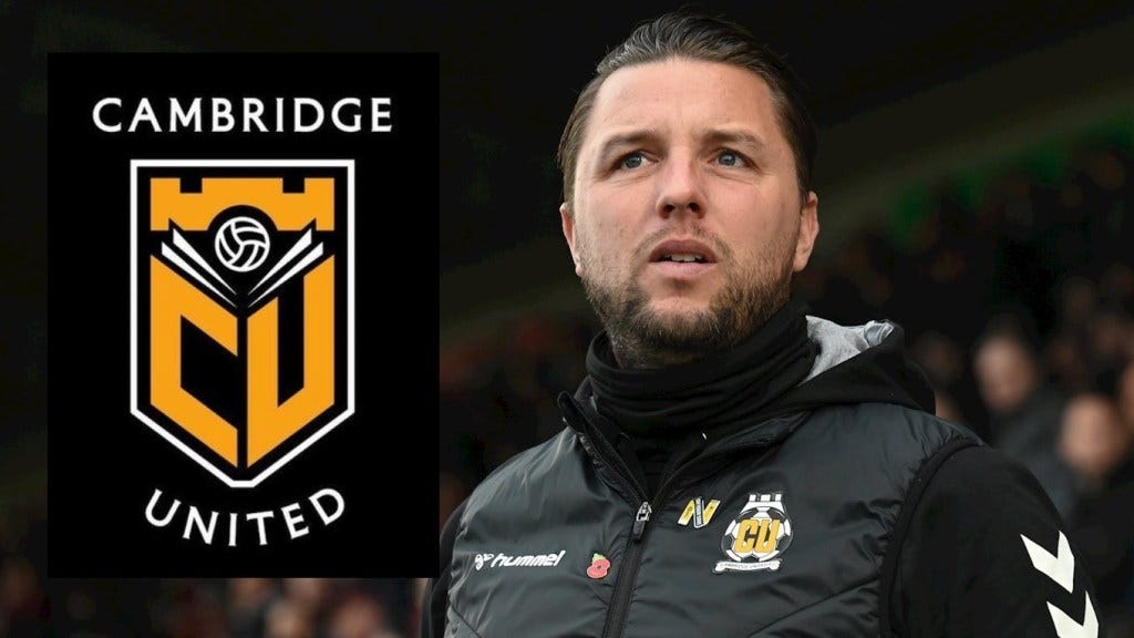
Bonner and Badge-errr...
A busy 24 hours at the Abbey saw the announcement on Thursday of a "long-term" contract extension for Mark Bonner, followed by a proposal a day later for a new club badge that was met with near universal disdain. @vinylperez shares his thoughts.
Let's start with the good news first then. Mark Bonner's contract extension: Despite a difficult spell last season, Bonner came through it with the backing of the board and managed to turn things around in time to complete the great escape on the last day of the season. Although some fans (disclaimer, I was one of them) called for his resignation last season, the performances we saw in the last few games (helped by a great dose of luck, but that's another story) as well as our strong start this season means 99.9% of U's fans (including myself) are now Team Bonner.
Mark fully deserves his new contract. Not only for the great escape, but for everything that's lead us to this point: survival, promotion, stability. His status as a fan counts for much too, as does his relationship with the board. After 3 wins in 27 games last season it would have been all too easy for Paul Barry to look for someone else, but luckily he stayed put. Loyalty works both ways, and Bonner has twice showed it to us now.
Listening to his interview it's clear he sees United as a long term project. He thinks there's more to come, and he thinks he can deliver it. That's not to say we might not struggle again as we're a financial minnow in this league, and the facilities at the Abbey are holding us back, but Bonner has seen the plans and thinks that the investment in the training ground and proposed plans for the redevelopment of the Abbey are worth sticking around for. If the clubs ambition was simply to survive by the skins of our teeth in League One each season I don't think Mark would have signed up for that, especially as we know he's been attracting attention from Championship clubs. We've a squad that can hopefully compete now, and an Abbey that's at near-capacity every week. For the first time in years the future is looking good for the U's, and Mark Bonner is going to help make that happen.
Now, onto this badge. We've been spoilt over the past four or five seasons really, since lockdown the club have barely put a foot wrong. Finances seem stable and the Abbey is ours again, communication with the fans is clear, the club shop has a queue out the door every game with fans clamouring to buy shirts, training gear and the retro kits the club have put out recently.
Late last season the club raised the possibility of changing the club badge, modernising it for commercial and identity purposes. It's not unfair to say our current badge divides opinion, it's unique for sure, but hasn't changed since 1986. Although it's the only badge many fans have ever known, 34 years isn't a hugely long time in the history of the club, and they've changed it during that time already, notably in 1996-98 and 2011-12. The club consulted fans, and appointed a design agency to come up with some proposals, so far so good.
But here's where it all goes wrong: yesterday the club showed a proposal for a new badge that has been overwhelmingly rejected by the fanbase. Reaction on social media was mostly negative, from both U's fans and fans of other clubs. As is always with football and socials, people were quick to take the piss, and that's exactly what they did.
I see what they've tried to do. Keep some elements of the existing badge (football, CU letter, Magdalene bridge) whilst harking back to earlier popular badges (book & ball) but in a modern, minimal style. But sadly this mis-match of styles just doesn't work when put together.
The bridge element at the top is too abstract, too stylised to look like part of a bridge. Okay, the bridge part on our current badge looks more like a castle, but at least it looks like something. The large CU seems like it's going to be the focal point of a new design, but then why have Cambridge United text in a big font above and below the badge? The text and font by itself looks great to my eyes, but if the CU isn't recognisable enough then ditch it - you only need one or the other. The book and ball is too busy, like it's been shoehorned in to a clean, minimal design. The shield is okay, but it's too angular, too 'American' in style. I know we have American owners, but we're not Wrexham.
If I'm honest, I could get behind a minimally-styled badge, West Ham, Arsenal, Norwich & Juventus have all successfully pulled off this kind of rebrand. There's just something about this particular effort that doesn't quite work. If we're going minimal and forward-looking then there's no need to have so many existing elements from our history. If we want to respect historical elements of the club badge then a more classic design is needed, mashing both together simply doesn't work.
The video the club produced to announce the badge was amazing, slick, emotive and paying respect to the great heritage of our club. The proposed badge sadly isn't any of those things, and I hope the club will do the right thing and go back to the drawing board.
What do you think about the new badge? Love it? Hate it? Think you could do better? Let us know on X/Twitter at @abbeystandpod or email us your thoughts at abbeystandpod@gmail.com.
We also want to hear your thoughts on Mark Bonner's contract extension. You're all happy about that right? As before, reach out via the usual channels.


